

Class Project
El Arbol Takeout Rebrand
Duration: One Week
Lead Designer
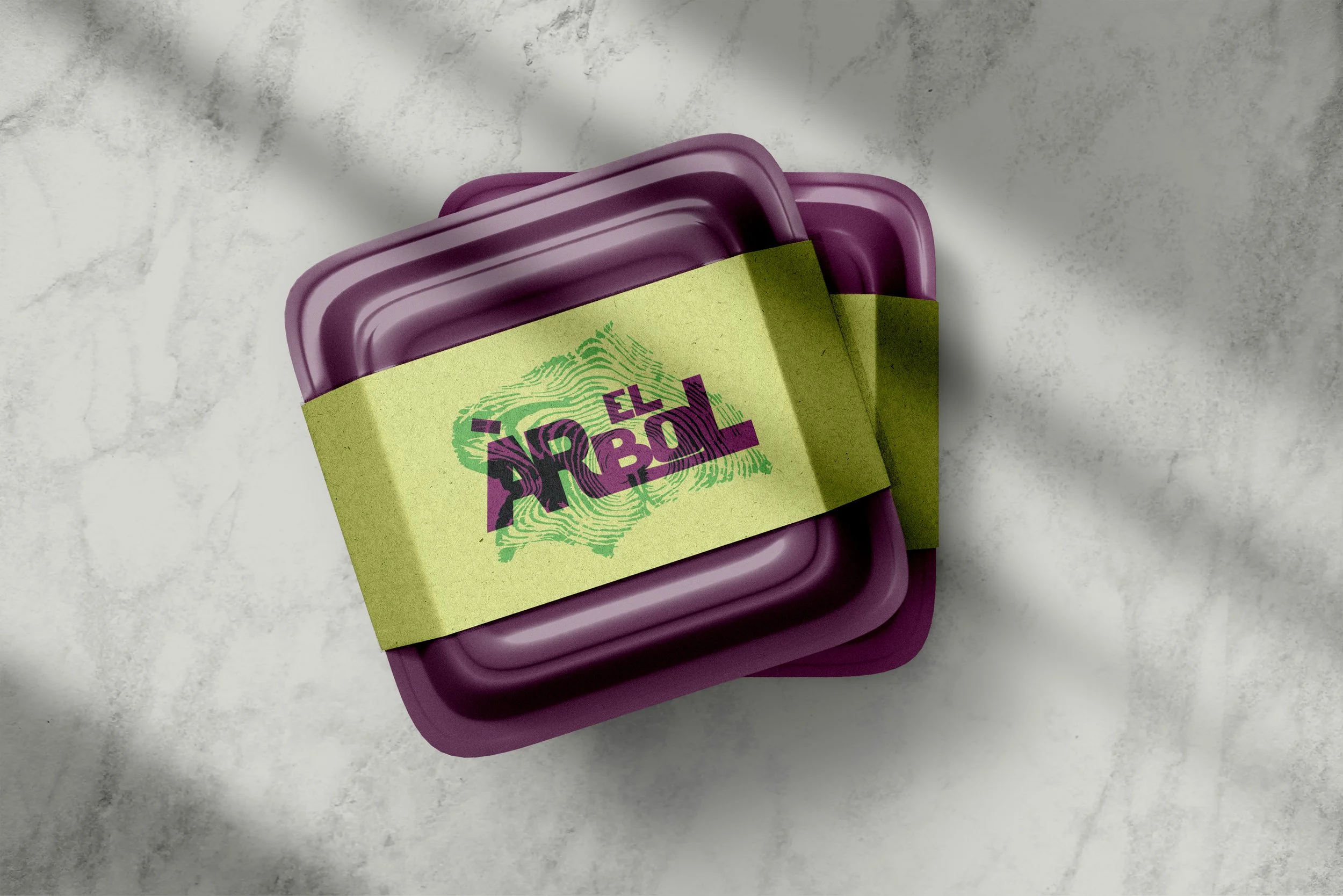
Many restaurants fail to extend their brand identity into takeout, relying on generic packaging that weakens the guest experience. This project explored how thoughtful design could transform takeout packaging into an extension of the restaurant’s personality, creating consistency, building loyalty, and making the unboxing experience as memorable as the meal itself.


El Árbol Taqueria, located in downtown Brighton, is known for its fresh street tacos, margaritas, and lively atmosphere. With a mix of indoor, outdoor, and walk-up taco window dining, it’s a neighborhood favorite and a vibrant destination for locals and visitors alike.


Original
My Version
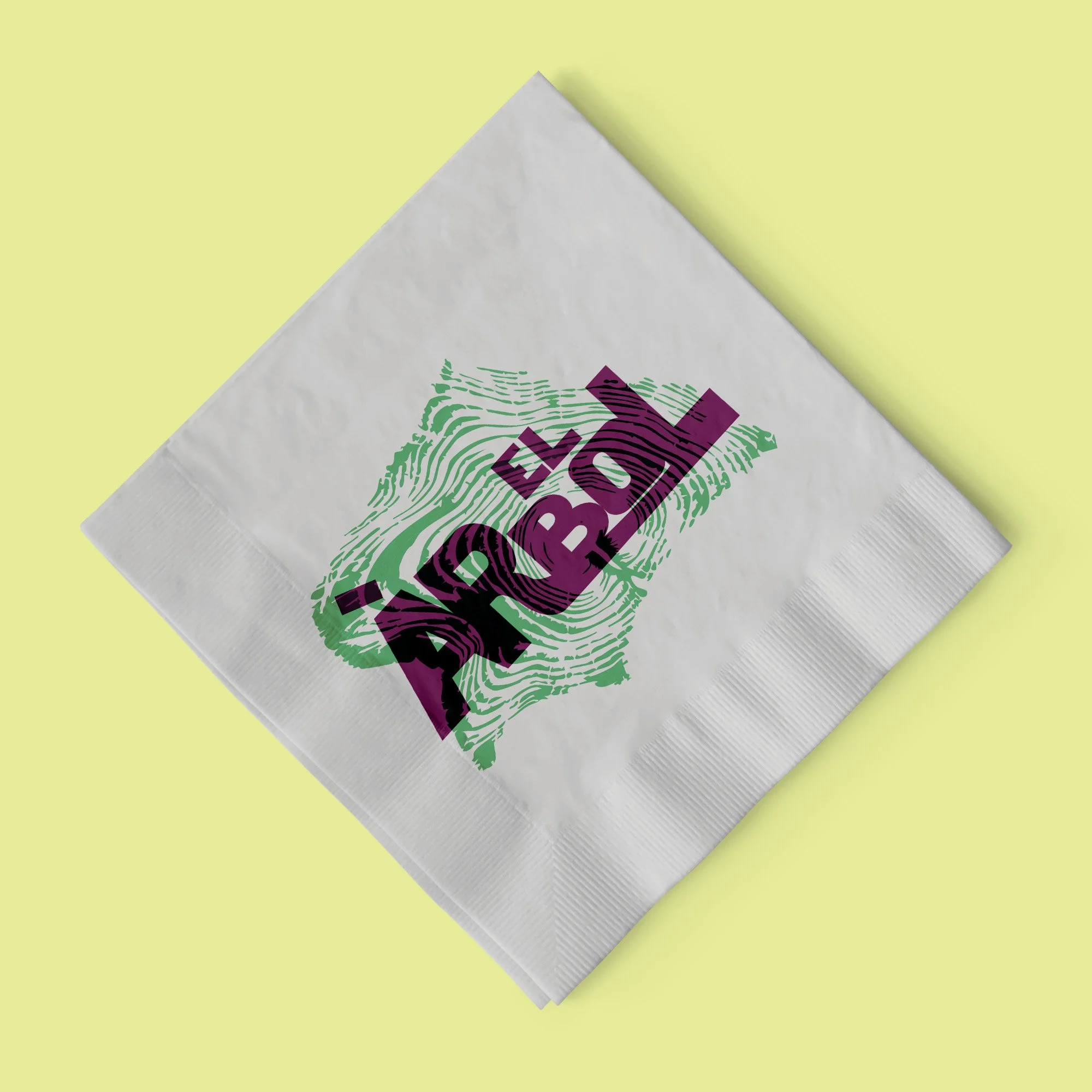
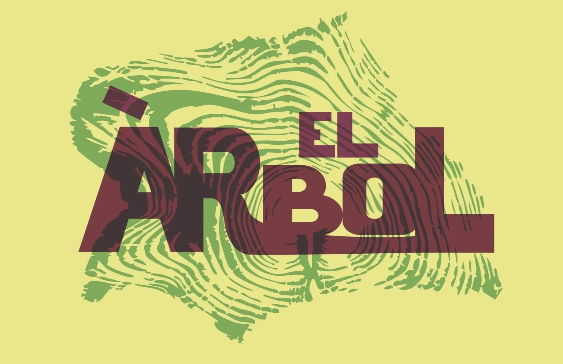
El Árbol, meaning “The Tree,” deserved a logo that felt as unique as the restaurant itself. The original logo was generic and blended in with typical Mexican restaurant branding, so I reimagined it using the visual of tree rings to reflect the name while creating a distinctive, memorable identity that stands out and connects to the restaurant’s personality.


The custom typeface logo was created using an overprint effect on Adobe Illustrator.
